

WEBSITE DESIGN
MY ROLE
As the sole designer for the project, my goal here was to translate directly the designer’s needs and taste for the web store, and to improve the sales conversions of the site’s visitors.
[Due to the pre-holiday rush of potential saless, the turnaround time given was 6 days.]
THE PROJECT
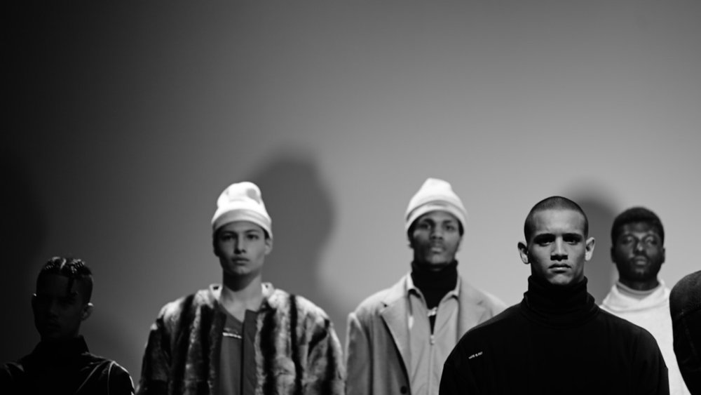
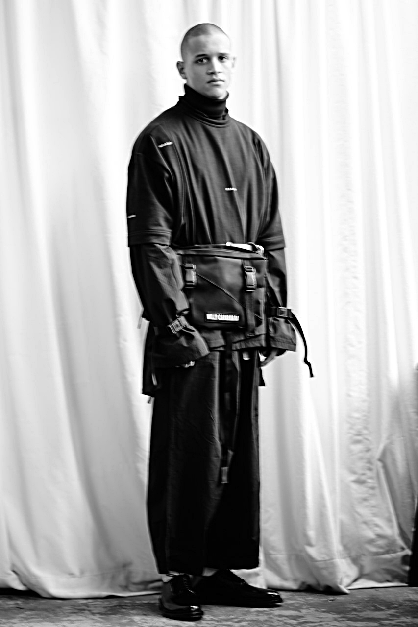
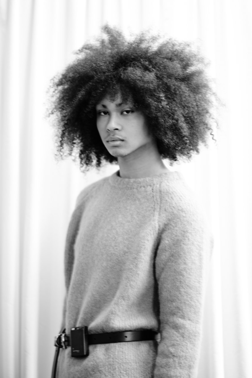
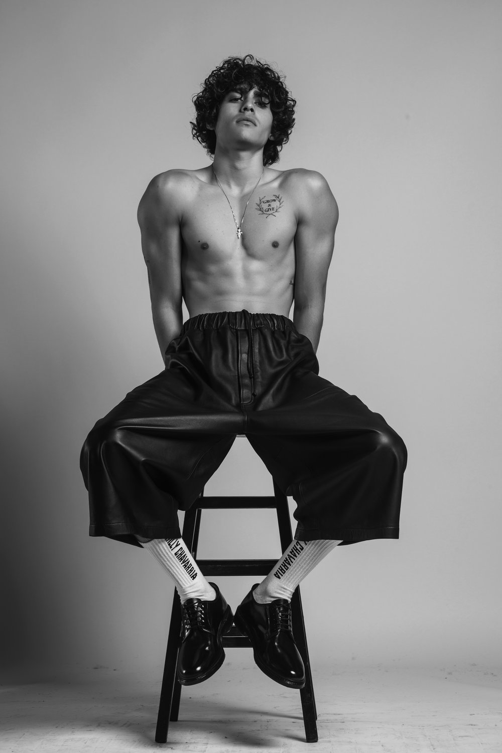
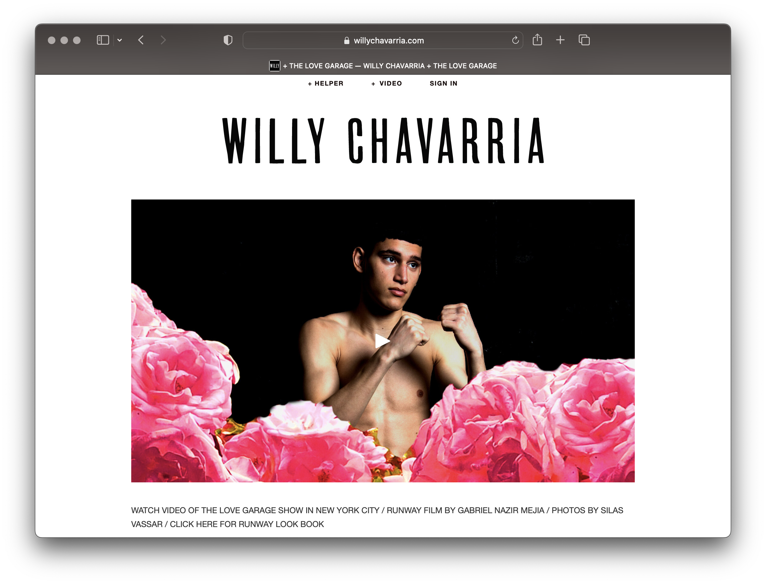
Willy describes his brand as “ a conceptual fashion label with a cinematic approach to design and presentation”. The brand boasts strong imagery in its editorial shoots, but these cinematic qualities did not come through.
THE GOAL
There were two primary goals here:
Increase sales
Reinforce the brand’s visual identity
UNDERSTANDING THE USER
PROBLEM STATEMENT
Shoppers were exiting the site at a high rate before browsing products. Therefore, sale conversions were low.
Shoppers were exiting the site at a high rate before browsing products. Therefore, sale conversions were low.
USER JOURNEY
Simple e-commerce journey. Get users to easily browse, filter, search, and checkout products.
With the majority of visitors coming from Instagram, and with over 60% of sales coming from mobile, the mobile shopping experience must be smooth.
Simple e-commerce journey. Get users to easily browse, filter, search, and checkout products.
With the majority of visitors coming from Instagram, and with over 60% of sales coming from mobile, the mobile shopping experience must be smooth.
USER PAIN POINTS
PAIN POINT: ENGAGEMENT
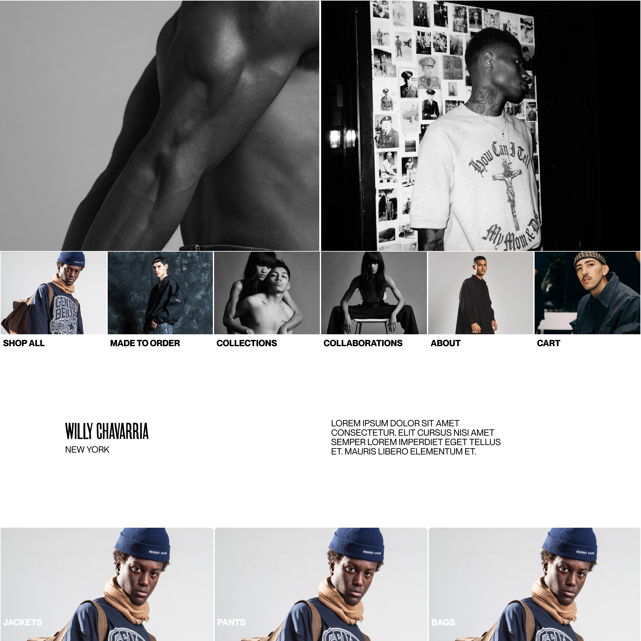
The homepage was not engaging, leading users to exit the site early.
![]()
PAIN POINT: MOBILE DISPLAY
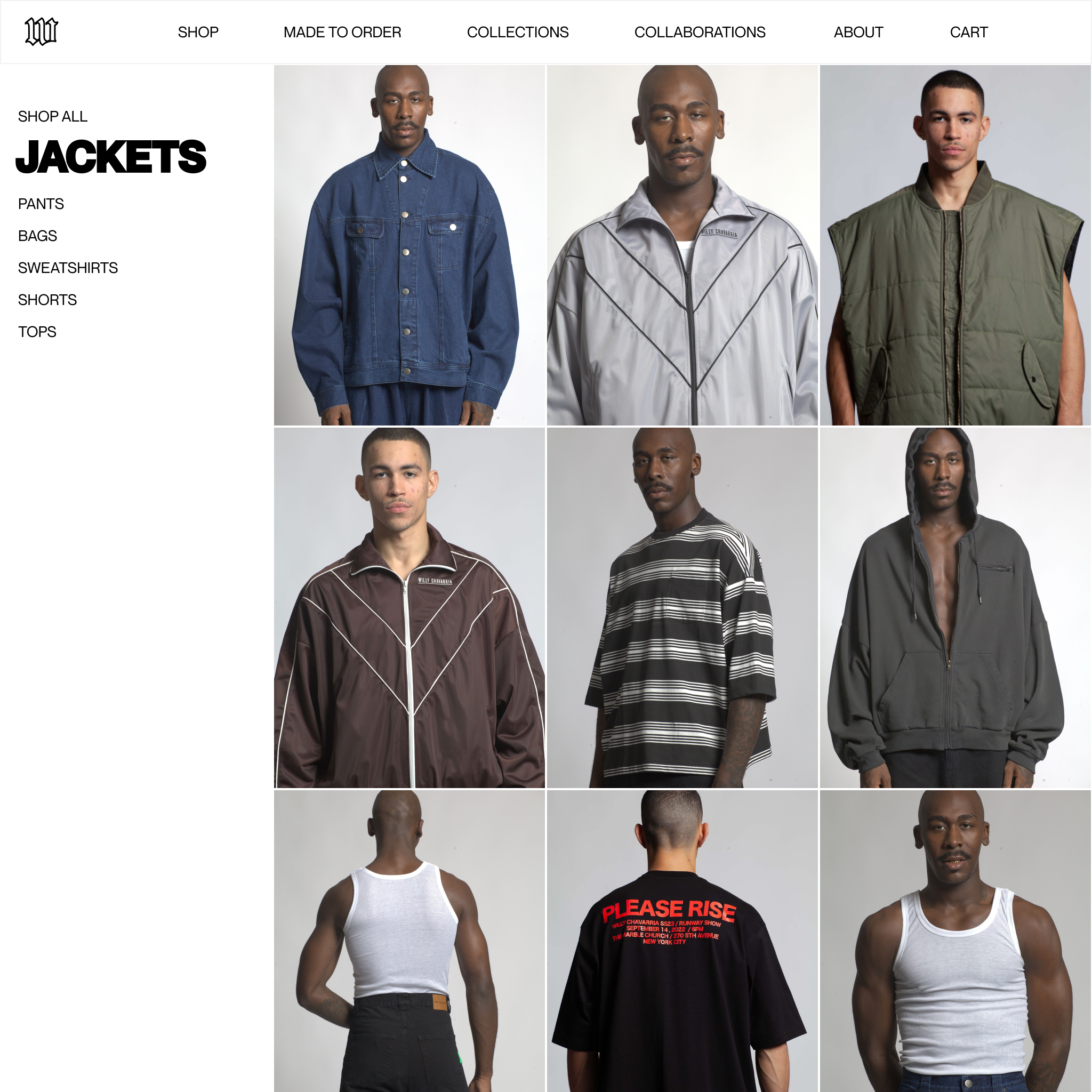
A single-column mobile display was too clunky when browsing for products, and made it impossible to scroll down through over 300 products.
PAIN POINT: HEADER
Header tabs were disorganized. They tried to showcase too many collaborations and runway shows, and these took attention away from the shop.
![]()
The homepage was not engaging, leading users to exit the site early.

PAIN POINT: MOBILE DISPLAY
A single-column mobile display was too clunky when browsing for products, and made it impossible to scroll down through over 300 products.
PAIN POINT: HEADER
Header tabs were disorganized. They tried to showcase too many collaborations and runway shows, and these took attention away from the shop.

PAIN POINT: FILTERS
Filters could only be found at the top of the page. Users spent unnecessary time scrolling back to the top to to search for a specific jacket or pant.
![]()
PAIN POINT: BLANK SPACE
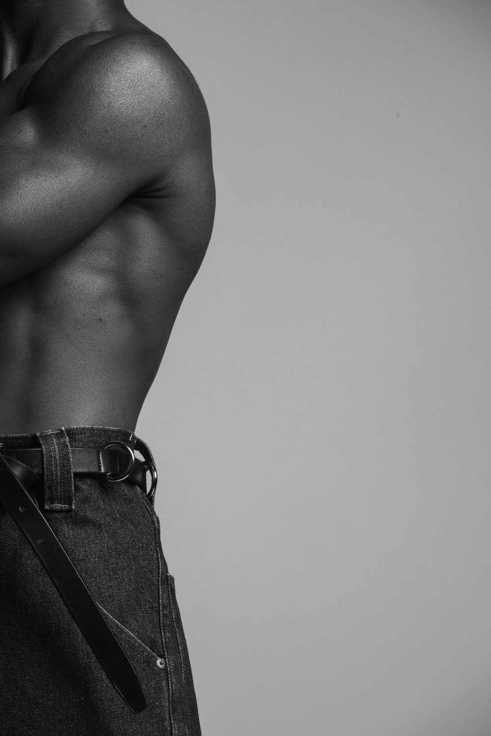
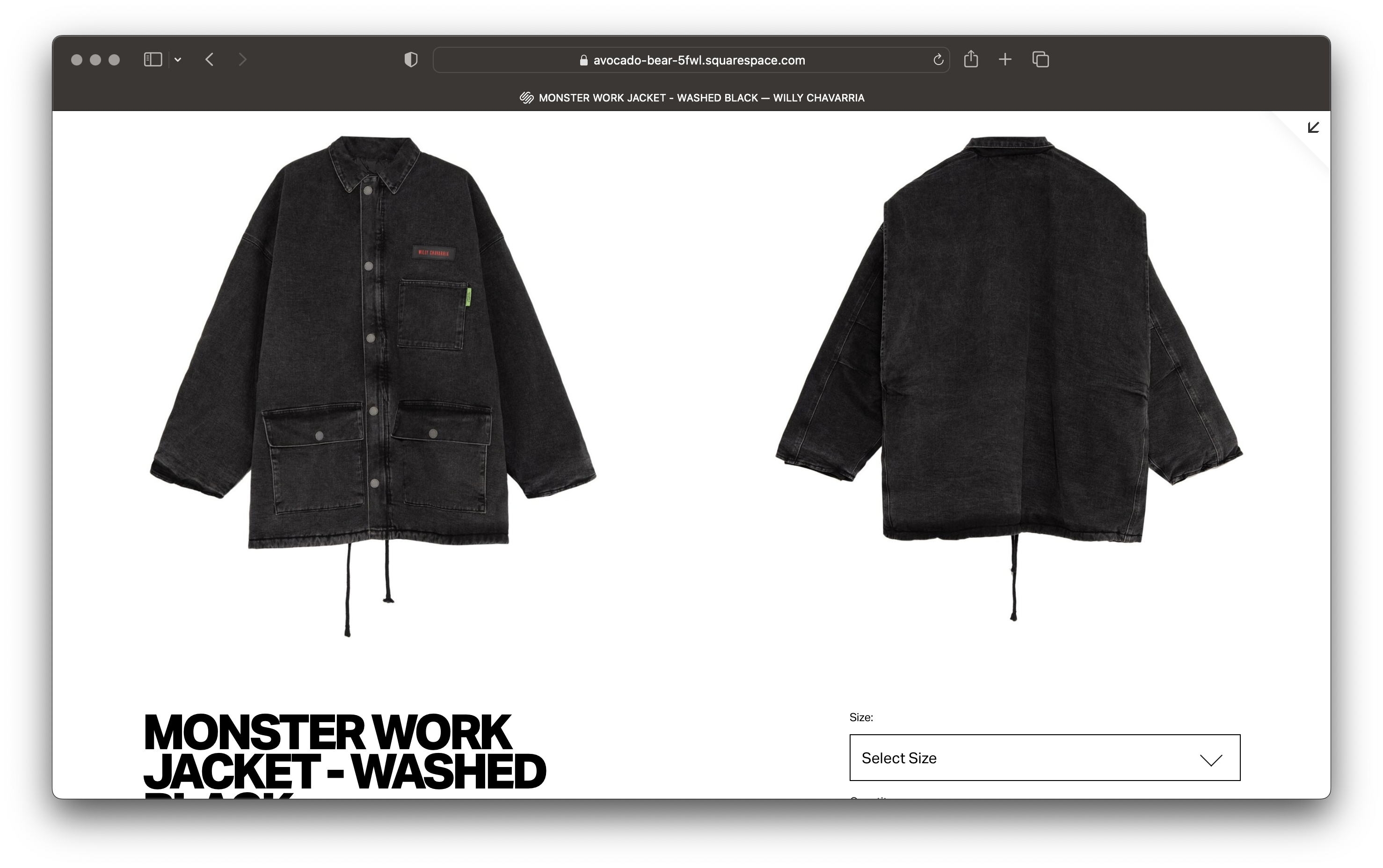
Whitespace was not used strategically to create a spacious ‘high-end’ feel often found within luxury e-commerce. Instead, it left the site with a feeling of emptiness. Plain product imagery also withheld shoppers from seeing how a shirt or a jacket would fit their body.
![]()
Filters could only be found at the top of the page. Users spent unnecessary time scrolling back to the top to to search for a specific jacket or pant.

PAIN POINT: BLANK SPACE
Whitespace was not used strategically to create a spacious ‘high-end’ feel often found within luxury e-commerce. Instead, it left the site with a feeling of emptiness. Plain product imagery also withheld shoppers from seeing how a shirt or a jacket would fit their body.

THE DESIGN PROCESS
STYLE GUIDES
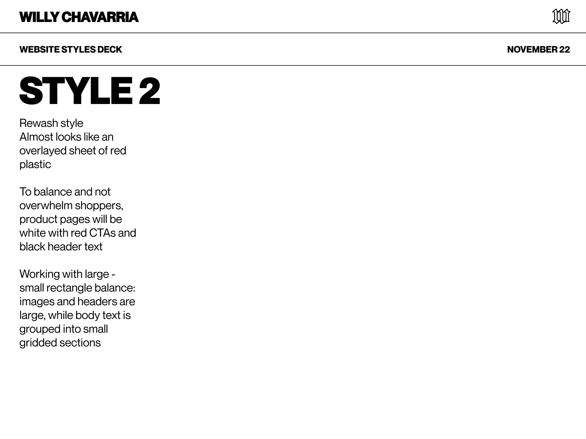
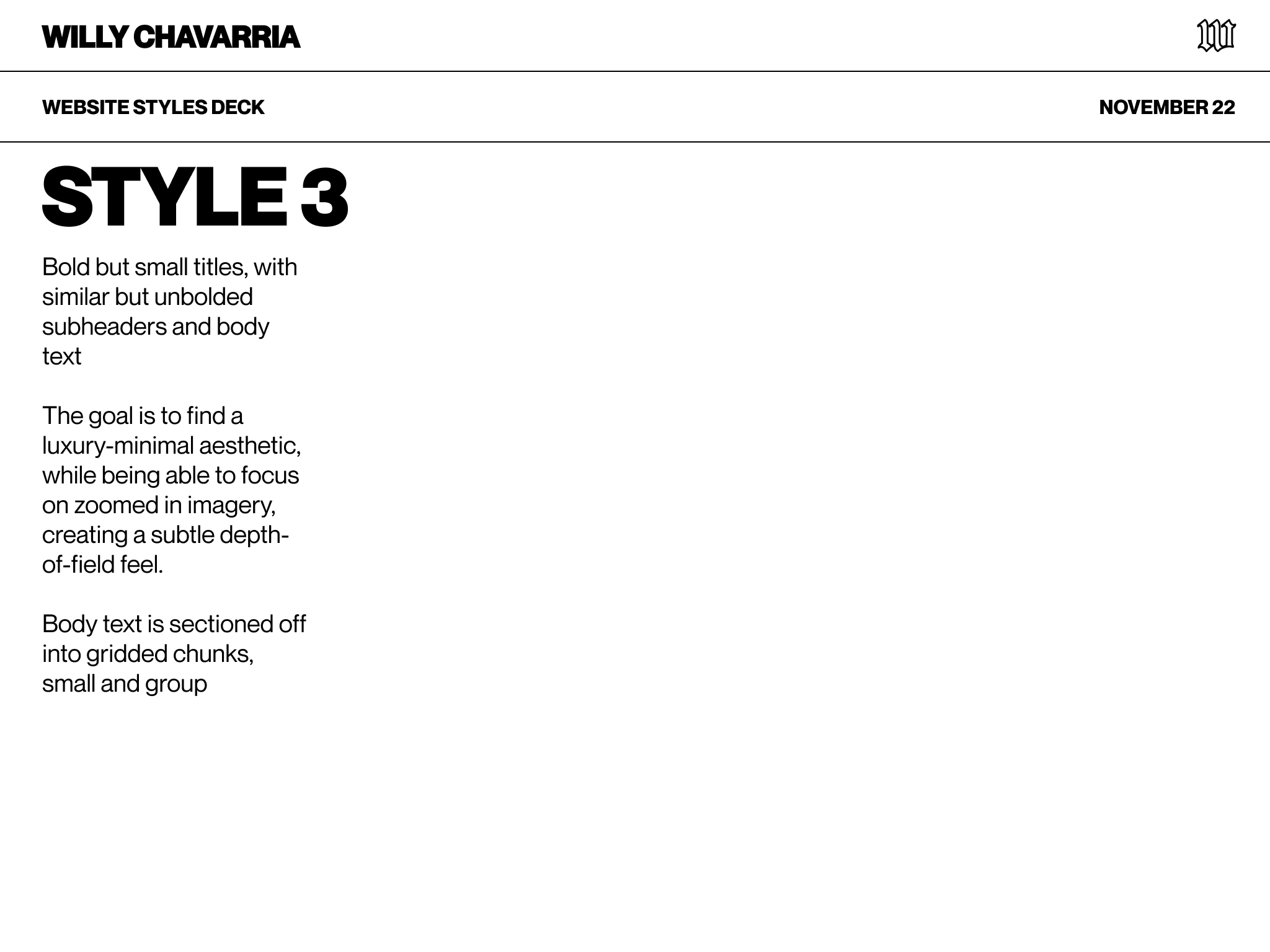
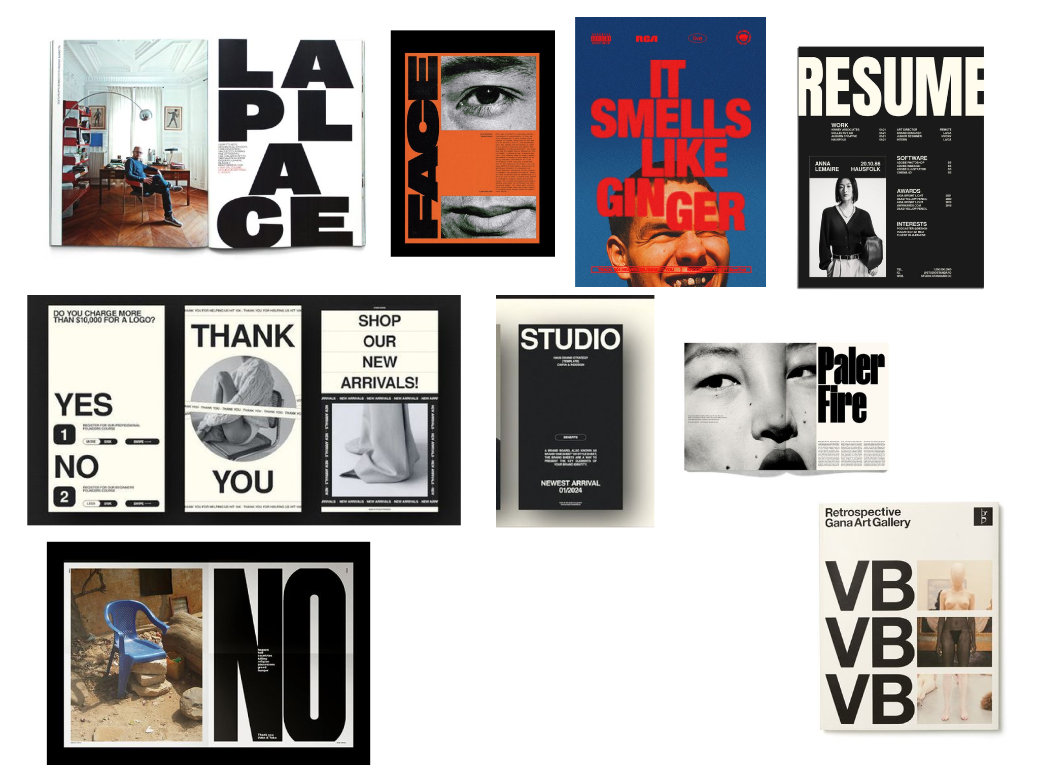
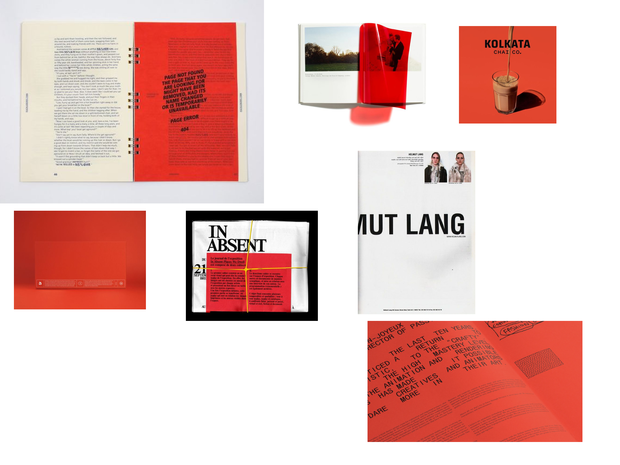
The designer was given 3 unique styles from which to pull assets and features he likes.
![Initial proposed typeface styles]()
![Notes from Style 1]()
![Notes from Style 2]()
![Notes from Style 3]()
SITE STRUCTURE
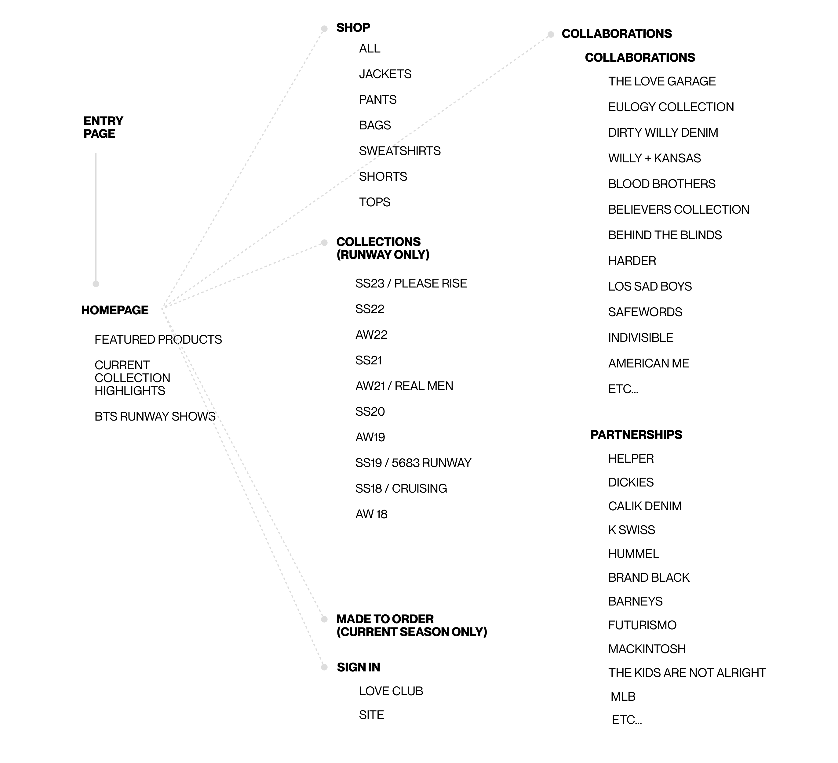
Categories were condesed to focus on shopping. Runway collections, collaborations, partnerships are avaialable for those interested in diving deeper into the brand. However, the primary focus remains on Ready-to-Wear and Made-to-Order shopping experiences.
![]()
The designer was given 3 unique styles from which to pull assets and features he likes.


SITE STRUCTURE
Categories were condesed to focus on shopping. Runway collections, collaborations, partnerships are avaialable for those interested in diving deeper into the brand. However, the primary focus remains on Ready-to-Wear and Made-to-Order shopping experiences.
VISUAL STYLE OPTIONS
These 3 styles were also displayed with image references to give the designer a preview of how the visuals on the site may be implemented.
![Style 1: Visual References]()
![Style 2: Visual References]()
![Style 3: Visual References]()
LOW FIDELITY FIGMA PROTOTYPE
Initial prototypes were presented to get a sense of how best to highlight products, display editorial images, and to provide options for a smooth checkout.
![Suggested cover page: Style 3]()
![Suggested product page: Style 2]()
![Suggested home page: Style 1]()
These 3 styles were also displayed with image references to give the designer a preview of how the visuals on the site may be implemented.

LOW FIDELITY FIGMA PROTOTYPE
Initial prototypes were presented to get a sense of how best to highlight products, display editorial images, and to provide options for a smooth checkout.


HIGH FIDELITY FIGMA PROTOTYPE


SQUARESPACE IMPLEMENTATION


SQUARESPACE: MOBILE


REFINING THE DESIGN
REFINED: MOBILE DISPLAY
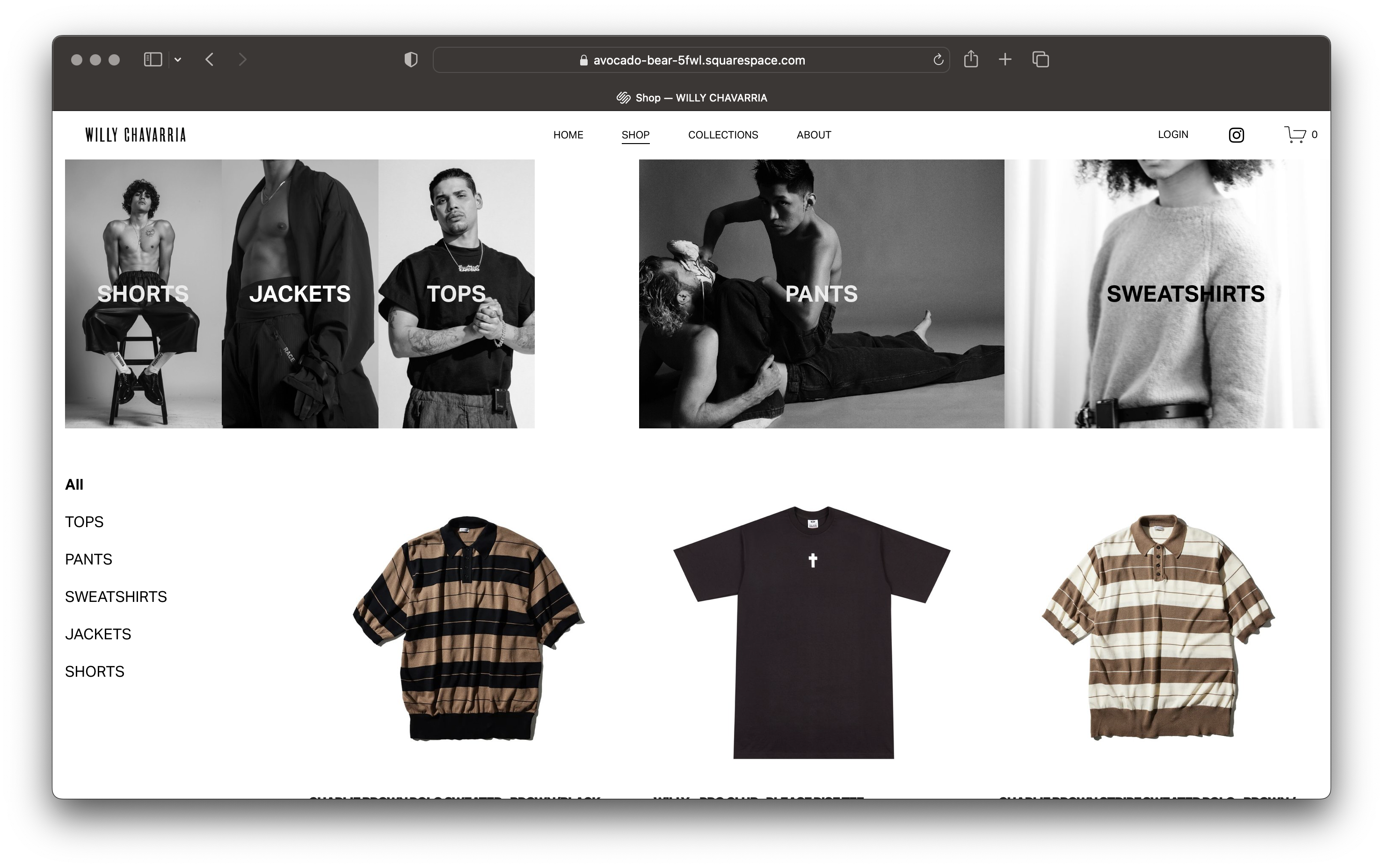
Mobile adjustments made 2 columns all the way down. This made so that more products can be seen at once, and in turn, directing traffic immediately to the shop.
TO BE REFINED: SEARCH
Squarespace’s built-in search function is not native to the site’s header, but can be added into the main pages of sites.
REFINED: HEADER
The header of images on the ‘Shop All’ section, which previously linked to product categories, has been removed. While it enhanced the product search visually, it was redundant and it added an unnecessary action for shoppers before they could browse for products.
THE BEFORE & AFTER LOOK
BEFORE
HOME

MAIN SHOP

PRODUCT

COLLECTION PREVIEW
FULL COLLECTION
AFTER


BRAND DECK
WILLY CHAVARRIA
BRAND IDENTITY
THE MAXX AGENCY
WEB DESIGN & IDENTITY
GEORGIANNA WELLS