

MOBILE APP DESIGN & BRAND IDENTITY
COMPANY: FEEDEL VENTURES
TIMELINE: 12 MONTHS

MY ROLE
As the sole designer for the project, my hand touched many facets of the user’s experience. I was also in charge of comminicating design decisions with the stakeholders, namely the business lead, the tech lead, and the team’s CEO. When I came onto this project with Feedel Ventures, the team had a user in mind, and they had a goal for the user.
From there, I was in charge of directing the user’s journey through the app. Step by step, we put together diagrams for the user’s engagements, built out our features’ concepts into wireframes, and translated those wireframes into a few iterations of low- and high-fidelity prototypes.
Additionally, I lead art direction for the identity of the Wanderrly brand.
THE CHALLENGE
Platforms like Expedia, TripAdvisor and others are generally outdated and rigid. They are mainly desktop-first and don’t provide collaborative tools that Milennials commonly engage with through social media. Instagram isn’t focused on travel. Pinterest allows collaboration but provides little control over content. Primarily, there is not an app that encourages younger travelers to take trips together.
THE GOAL
Our aspiration was to build an all-encompassing mobile app for young travelers to collaborate, plan, and share their trips.


UNDERSTANDING THE USER
MISSION STATEMENT
Wanderrly is a mobile platform for collaborative travel experiences, one that allows users to share inspiration and plan trips together with friends. Our team at Feedel designed it to serve millennials looking to curate adventurous trips with small groups of friends, anticipating a post-Covid travel boom.
Wanderrly is a mobile platform for collaborative travel experiences, one that allows users to share inspiration and plan trips together with friends. Our team at Feedel designed it to serve millennials looking to curate adventurous trips with small groups of friends, anticipating a post-Covid travel boom.
USER PERSONAS
We didn’t define universal personas to identify our users.
Instead, we established a comprehensive list of qualities that we wanted to gear our features towards. This project began during the mid-stages of COVID, while travel was restrictive, and this prompted our team to target the demographic that would be eager to travel once constraints were lifted.
This list included travelers who...
...are primarily Millennials, around ages 18 - 28
...planned trips together
...prefered using apps like Pinterest and Instagram to find locations and events to travel to
...used apps like Venmo & CashApp to coordinate shared finances

DESIGN PROCESS: STARTING WITH THE USER
USER STORIES
We mapped our potential users’ journeys, and we used their needs to categorize the features we should implement.
(i.e. selecting cities to travel between, exploring activities in selected cities, finding events on selected dates, etc...)
We began by translating actions into a series of flows.
![]()
We mapped our potential users’ journeys, and we used their needs to categorize the features we should implement.
(i.e. selecting cities to travel between, exploring activities in selected cities, finding events on selected dates, etc...)
We began by translating actions into a series of flows.
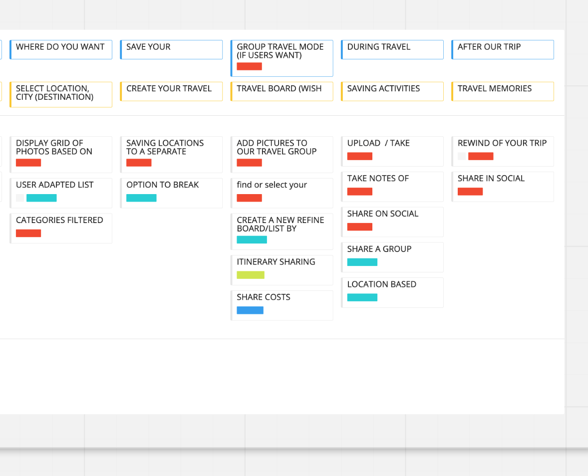
USER NEEDS
- Feed for browsing traveler’ shared posts.
- Map showing near by events, nightlife, cafes, etc.
- Filters to cycle through activities and locations.
- Tool(s) for mapping day-to-day itineraries.
- Tool(s) for splitting costs and keep a running total.
- A few unique styles for displaying trip experiences and for sharing itineraries.
USER FLOW

GOALS & OPPORTUNITIES
[Essentially, our user needs but refined and more targeted outcomes]
GOAL 1:
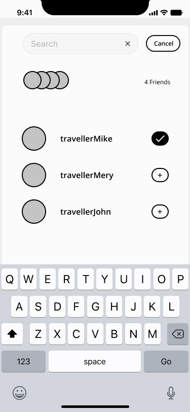
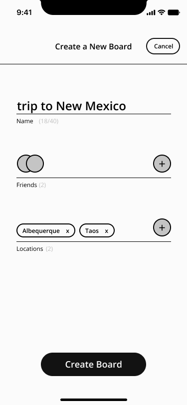
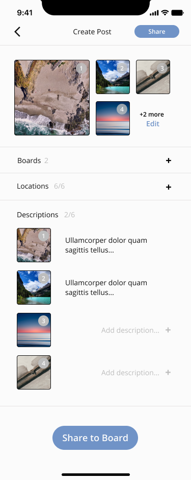
Allow users to build travel boards from images they’ve collected from friends and strangers.
OPPORTUNITY 1:
Boards will display certain variables: locations, events, and scenes. Each with their own parameters. Locations are things like restaurants and bars and shops. Events will have a date and time attached. And scenes will be sites to be vistited at any time.
Each of the variables will be displayed on your board and can be collected by your friends for their boards.
Each board can be shared with friends who will be taking this trip with you, and it can be tagged with specific cities that you will be exploring.
FEATURE: BOARD CURATION

GOAL 2:
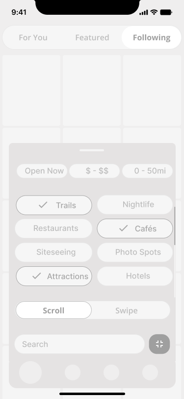
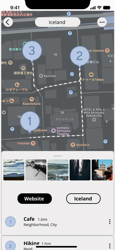
Design a map that is spatially conducive to discovering new spaces and events. This map should also allow place-to-place planning (but not navigation, necessarily).
OPPORTUNITY 2:
Maps will have two variances: Explore & Itinerary
Design a map that is spatially conducive to discovering new spaces and events. This map should also allow place-to-place planning (but not navigation, necessarily).
OPPORTUNITY 2:
Maps will have two variances: Explore & Itinerary
- Explore variance will have search and filter features.
- Itinerary variance will have an expandable overlay that allow a route to be planned between multiple locations.
FEATURE: MAP VARIANCES
![]()
![]()
![]()

GOAL 3:
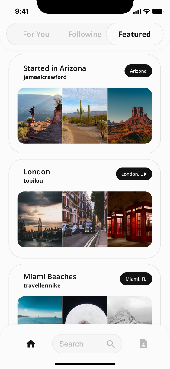
Sharing content as you travel will be the primary source for others planning trips in the same cities that you’ve traveled to.
OPPORTUNITY 3:
Friends and strangers can see your posts on their feed and collect them for their own travel boards. We aim to make collaborating with your friends in this way better than finding recommendations from travel blogs.

UTILIZING & REFINING WIREFRAMES

VISUALIZING SCREEN-TO-SCREEN FLOW
In order to communicate clearly how each of our screens would impact the project, we laid our user flows with the wireframes together. This helped our developers and business advisors see visualize how our research connected with the product experience.


ITINERARY DEVELOPMENT
The itinerary features we developed would be the tools that would set apart out product from other travel apps and blogs, so the refinement of these screens were key, and are what we spent the most time polishing. We began with a simple wireframe focusing on a map, and we added tools to it. Routing from place to place became a focus, as did re-ordering locations so you can fit in everything you need to see that day while eliminated extra travel between them.
The itinerary features we developed would be the tools that would set apart out product from other travel apps and blogs, so the refinement of these screens were key, and are what we spent the most time polishing. We began with a simple wireframe focusing on a map, and we added tools to it. Routing from place to place became a focus, as did re-ordering locations so you can fit in everything you need to see that day while eliminated extra travel between them.


SEARCH & FILTER
Finding new cuisines and places to see are essential parts of exploring a new city. For us, this meant that the ways in which your search, filter, and catgorize each thing you want to do are all incredible important. We want these things to be useful tools and not cumbersome mechanisms. Our refinement process consisted of paring down bulky grids and lists into simplified dropdowns and abbreviated categories.
We also wanted them to represent visually, that beauty in travel, so we explored graphical elements like boarding passes and collecting passport stamps to identify tools.
REFINING THE DESIGN
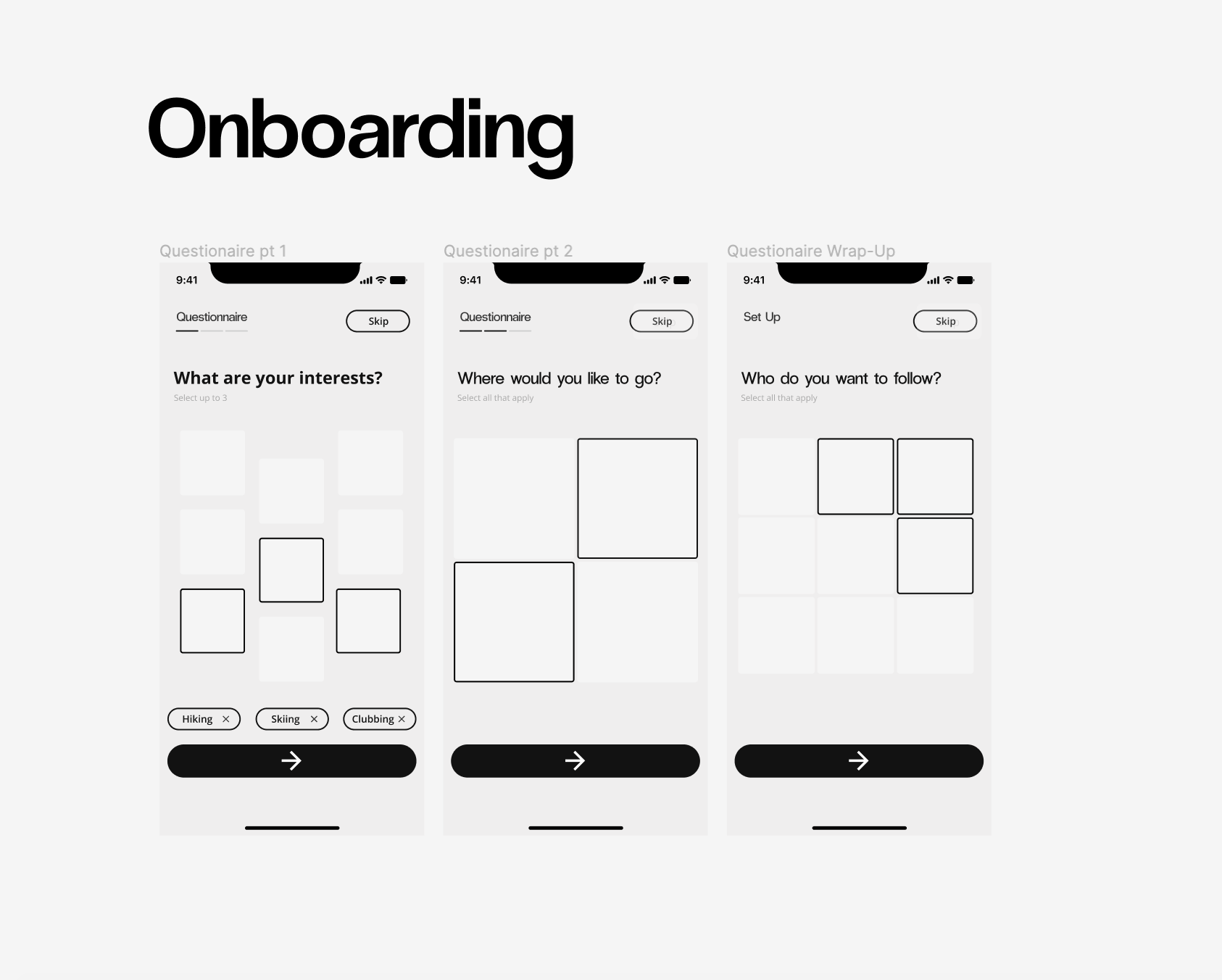
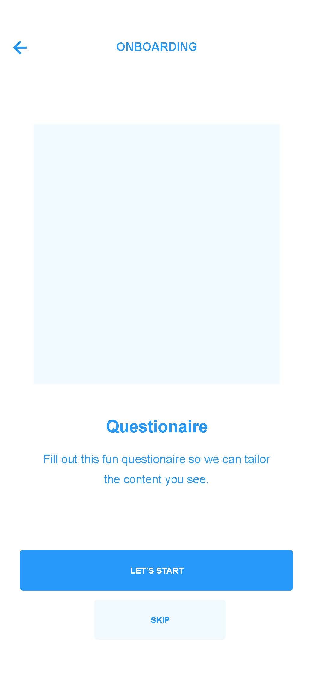
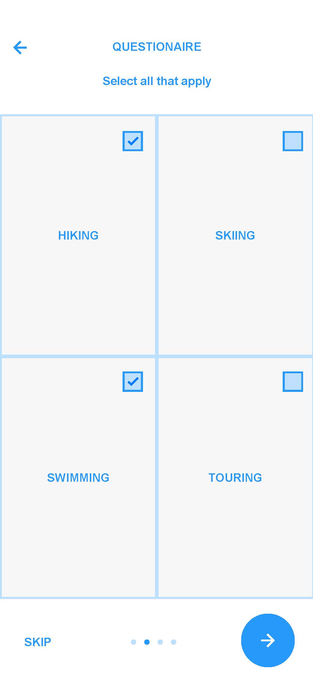
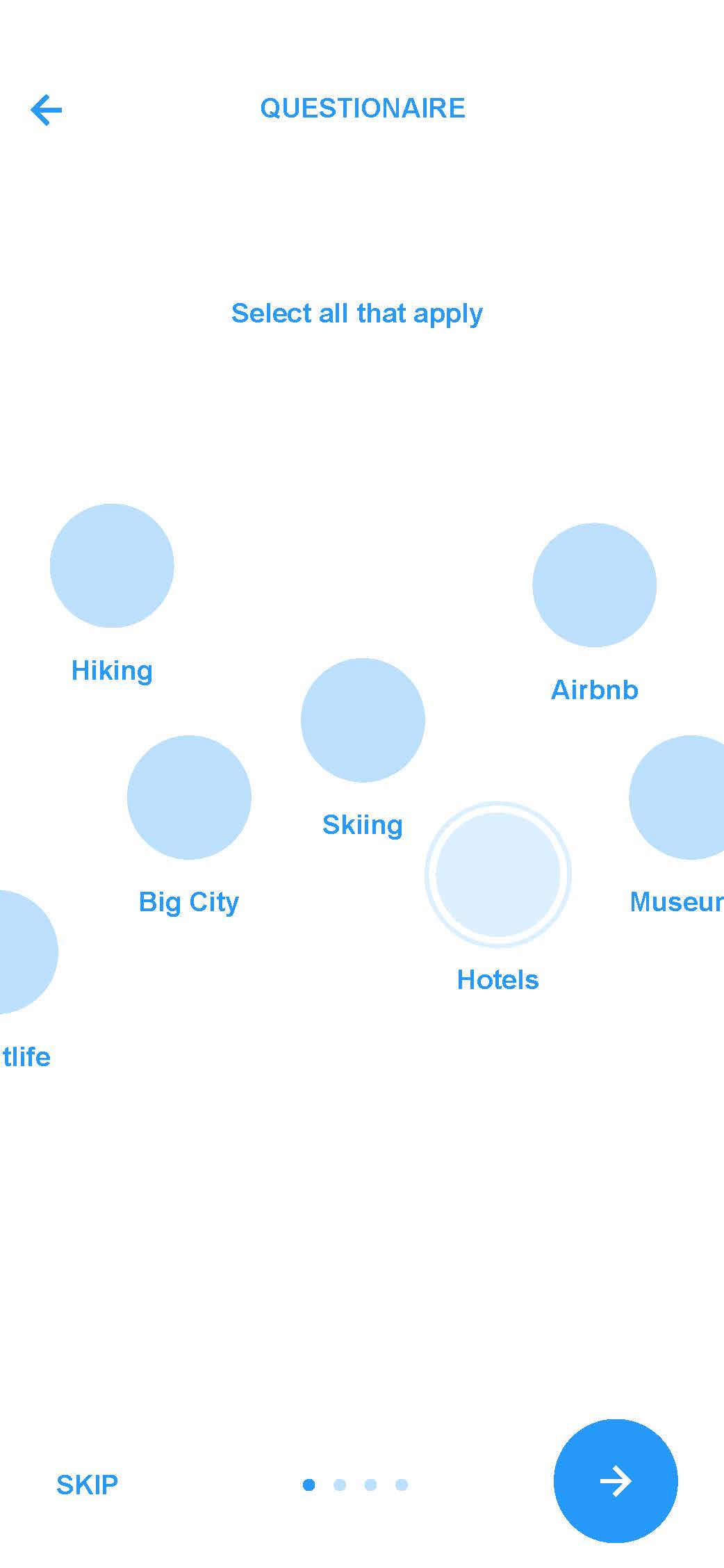
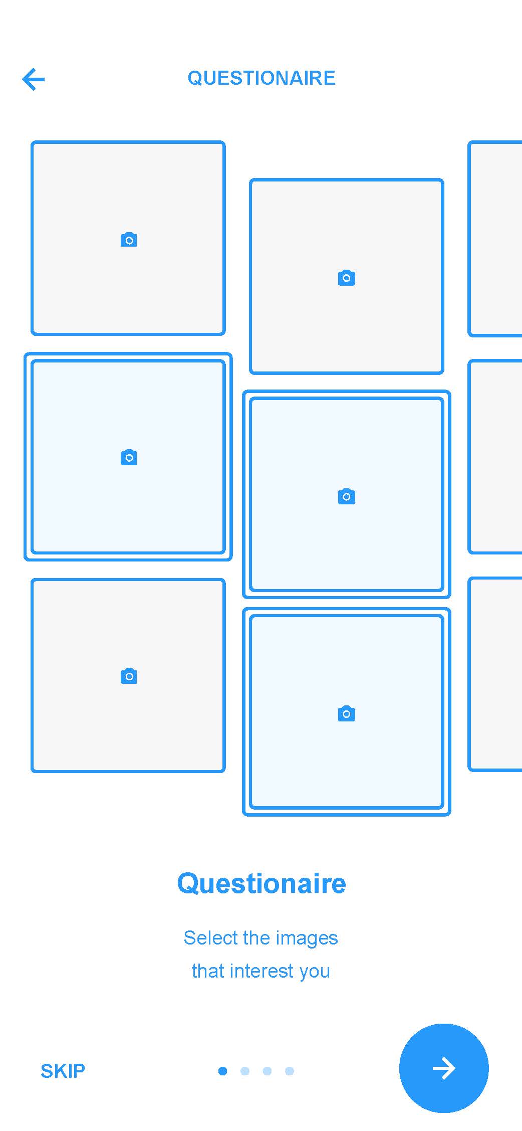
REFINED: ONBOARDING
Our initial development for our onboarding process was lengthy and cumbersome, so we cut back though iterations of later wireframes. Even after the new iterations, we realized through basic testing that the questionaire was detering users from entering the app, so we elimated the onboarding altogether. Because the date collected would still be helpful to providing personalized content, we decided to allow users to find it later on, in their profile, in the case that they wanted to improve the algorithm. While our goal was to capture attention in an interactive feature, ptional, not forced, was our resulting application.
BRAND IDENTITY
VISUAL CONCEPT: FILM SLOTs


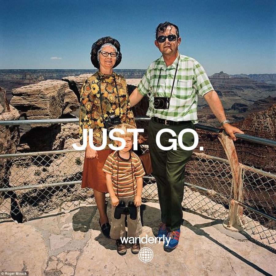
IMAGE CONCEPT: AMUSING GROUP PHOTOGRAPHY


BRAND DECK
WILLY CHAVARRIA
BRAND IDENTITY
THE MAXX AGENCY
WEB DESIGN & IDENTITY
GEORGIANNA WELLS