
The design of this online store for Forrest Commons’s, a sustainably-focused brand, encourages users to explore the materials while they shop.
Note: This personal project to explore
customer priorities when shopping eco-consciously.
The currently-active web store that is does not fully reflect the research behind it. For a first-round product, the store has launched intitially tostylize the brand and sell only the first collection of shirting.
To view more of the brand, click here. As the brand scales, we plan to move toward the research-backed format shown here.
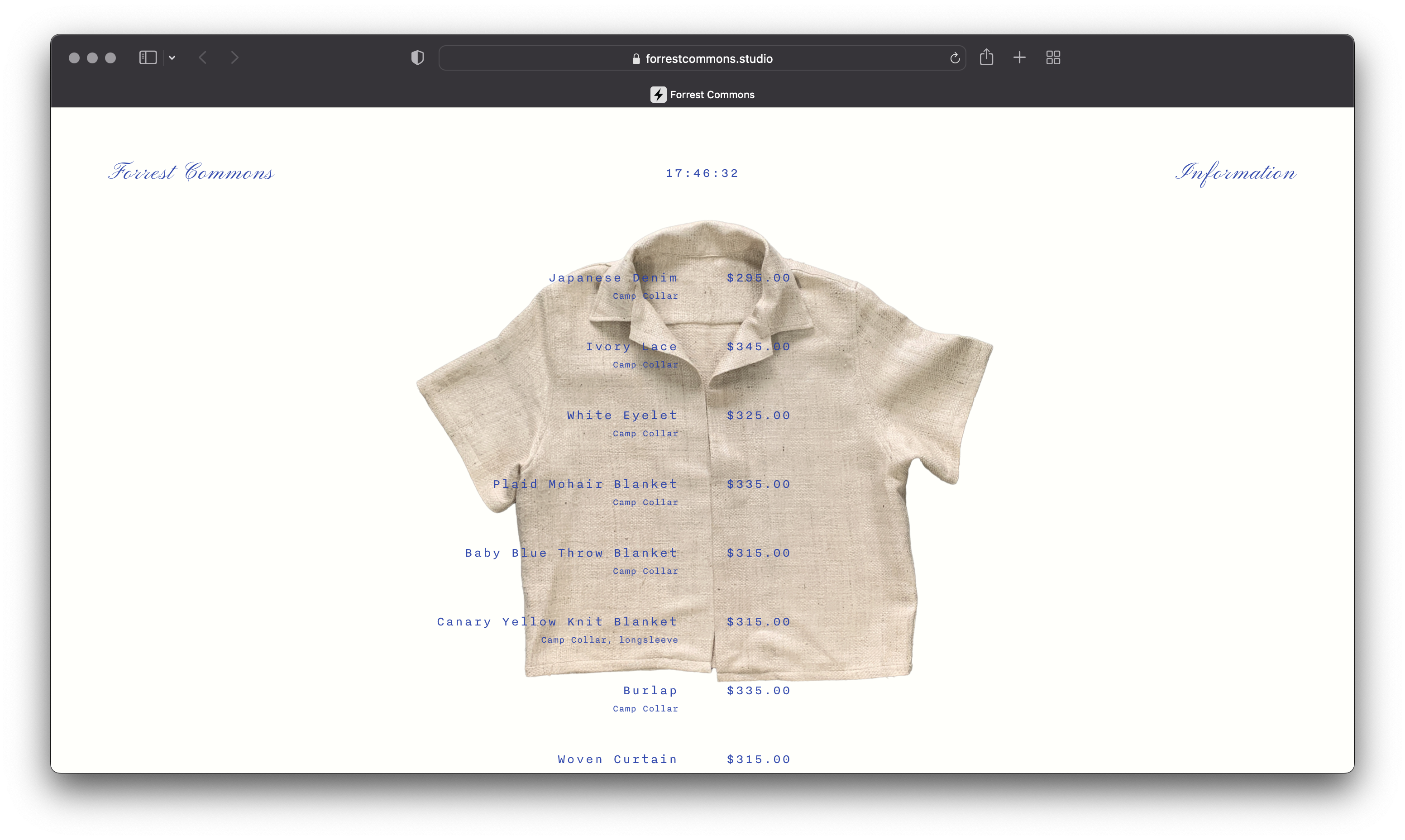
This is our active web store at https://forrestcommons.studio. The research below reflects our next steps as our brand grows.


- The Project Brief & Our Challenges
-
Takeaways into Wireframes
-
Building the Primary Features
-
Re-Evaluate & Re-Iterate Features
-
Our Nutrition Sheet Mentality
-
Materials Library
-
Brand + E-Commerce References
PROJECT BRIEF AND CHALLENGES
My objective here has been to:
- Decipher how shoppers consider sustainble options when buying clothing.
- Get a sense for what premium are they willing to pay for a healthier product.
- Find out who are the people who care to make this sacrifice.
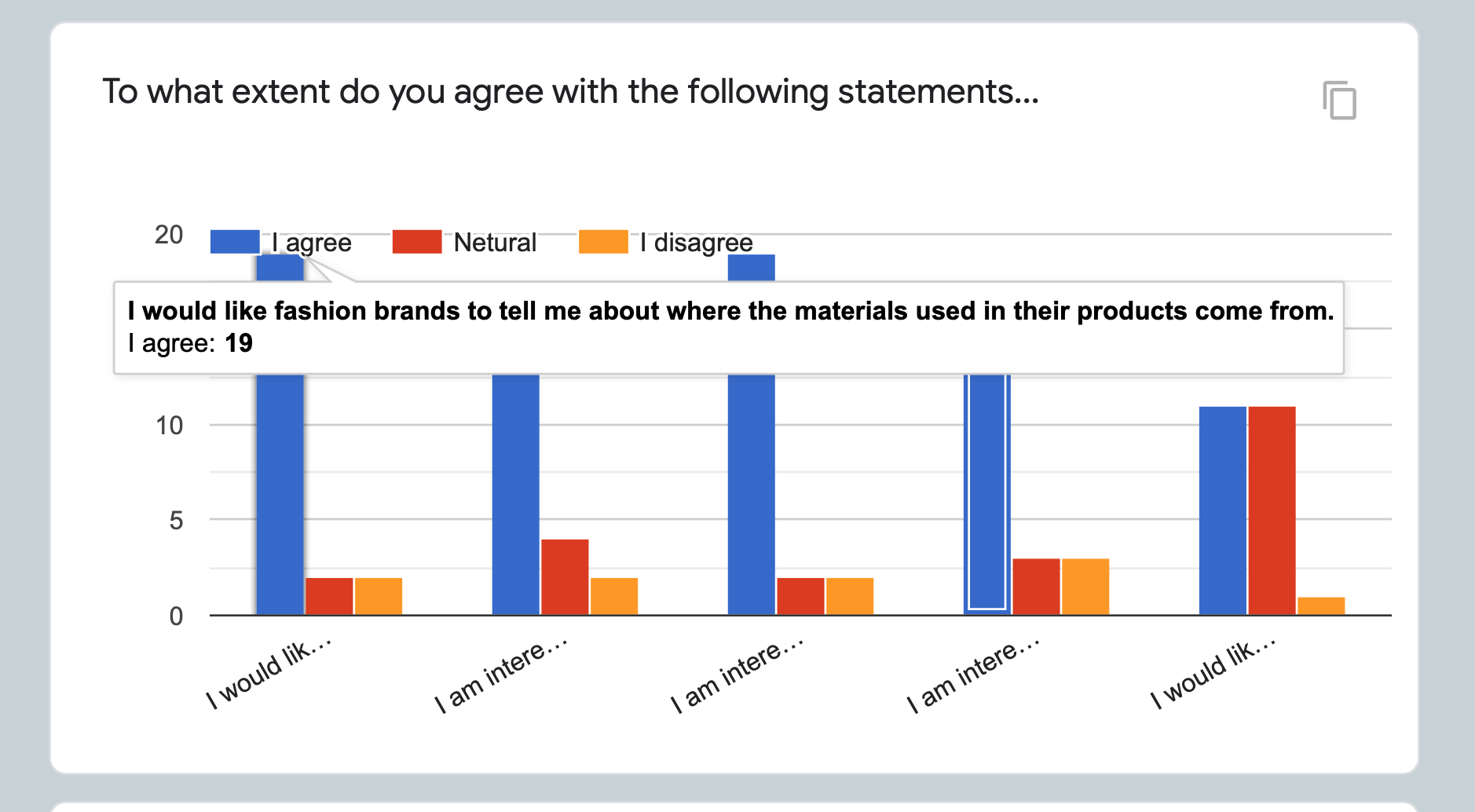

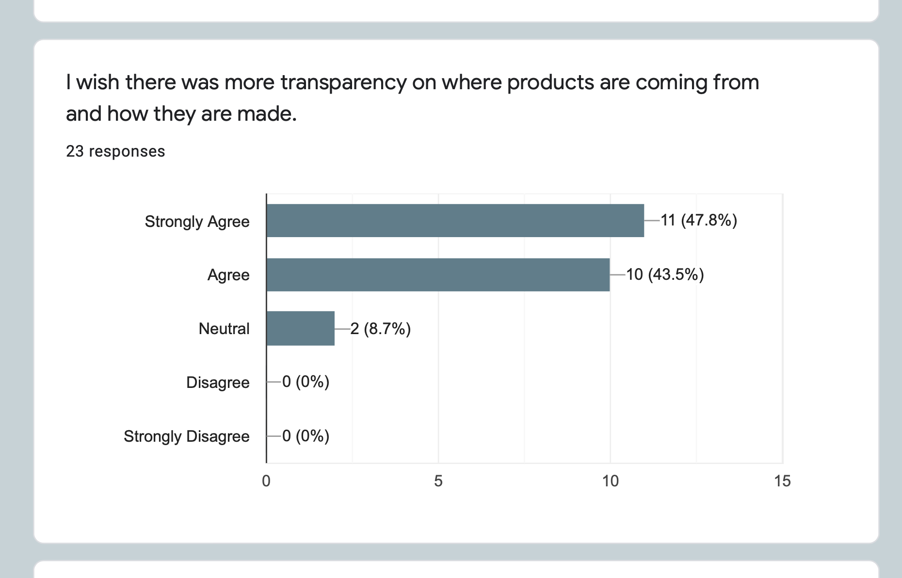
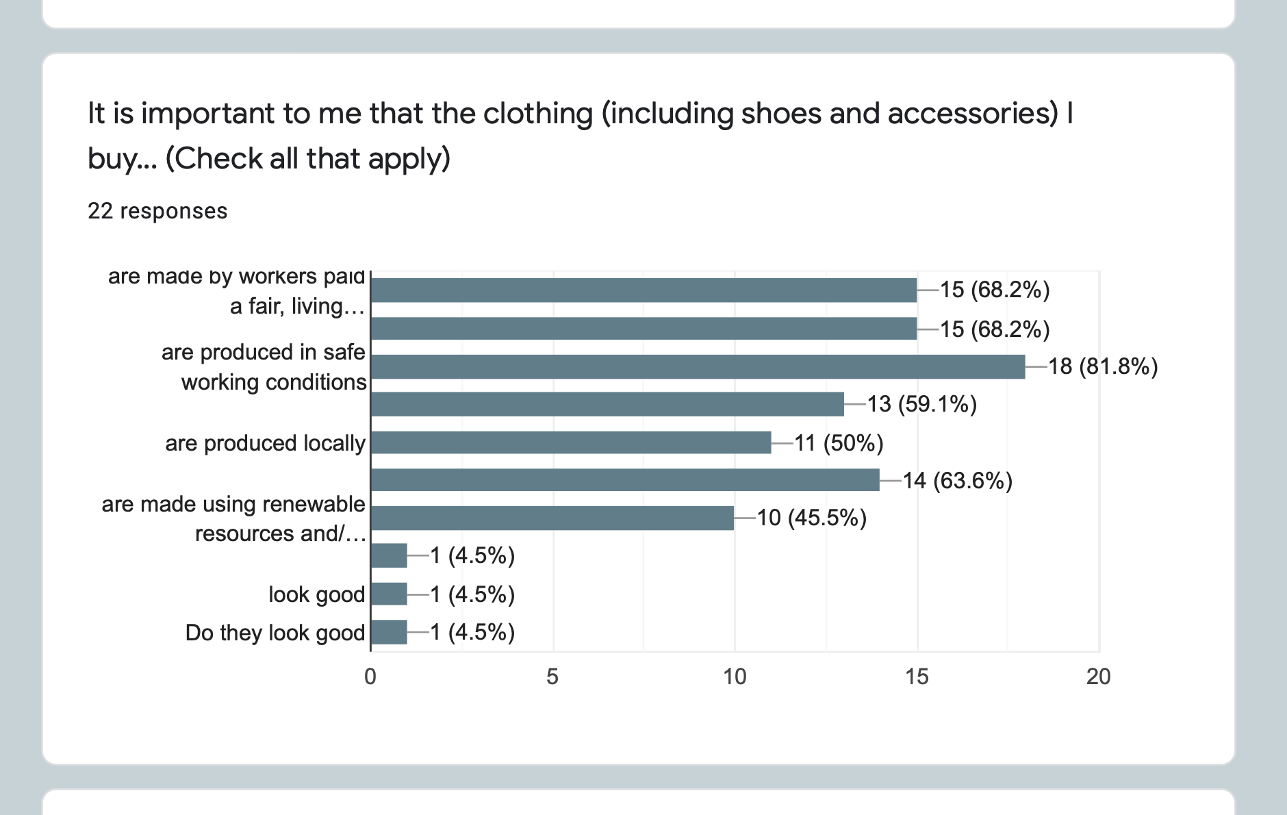
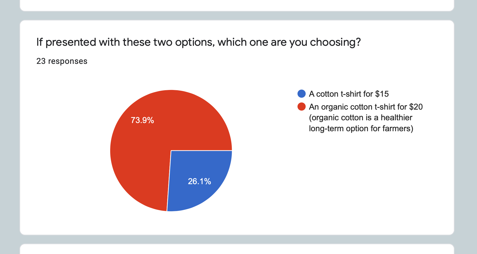
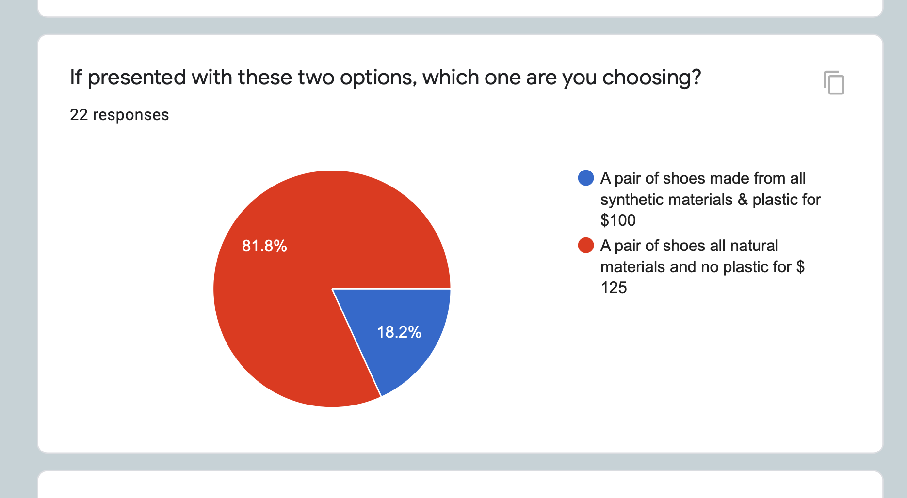

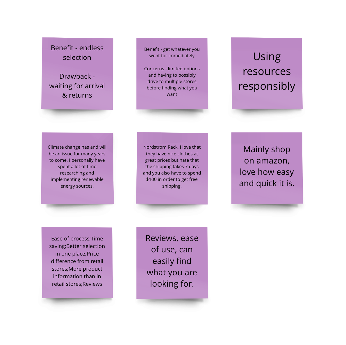
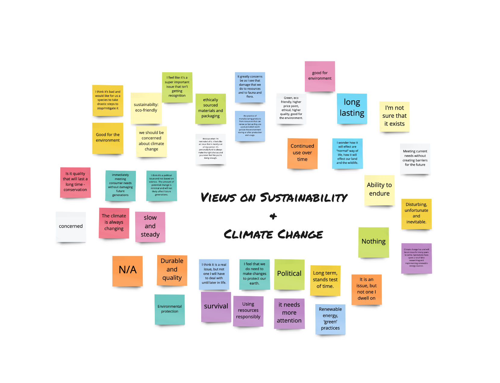
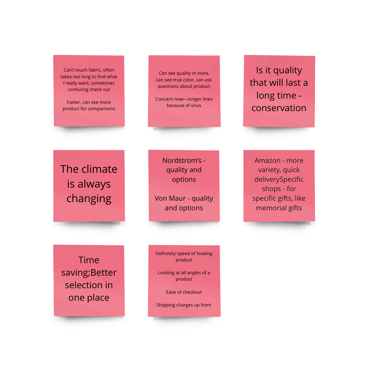
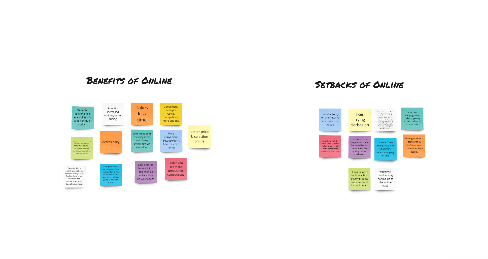
SHOPPER SURVEYS
Sureys were conducted to...- Gauge which which ‘sustainability’ factors influence shoppers’ decisions.
-
Construct demographics that organize shoppers by age, budget, or enthusiasm regarding healthy products.
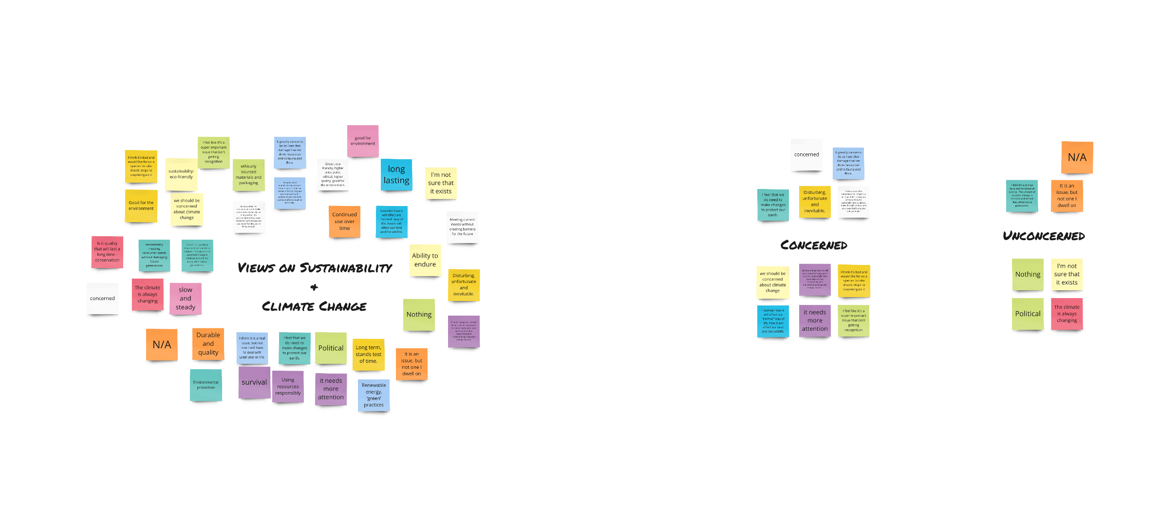

RESEARCH TAKEAWAYS
I organized the takeaways from the survey to guide the building of wireframes.
The features needed are shown to be:
- A materials library to educate shoppers on what composes the thing they’re buying.
- A guide informing shoppers of who’s making their clothes and the conditions they work in.
Everything else on the sites is to be structured as a typically e-commerce site to showcase & sell products.
PRIMARY FEATURES
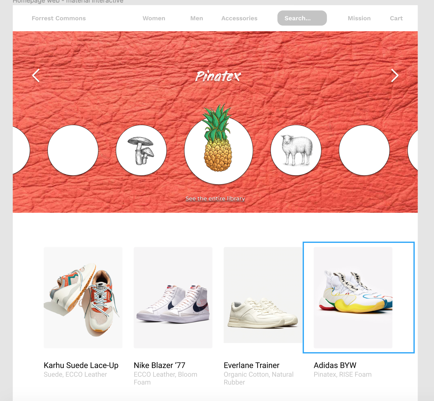
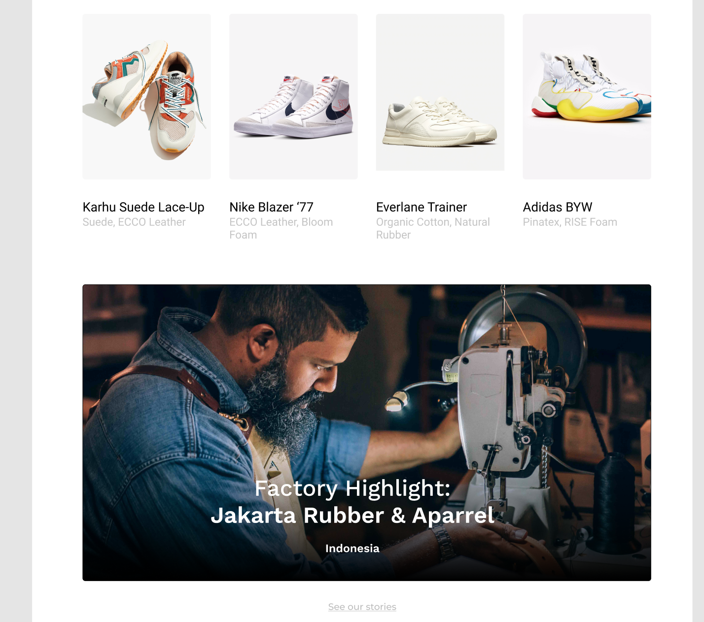
- Materials Library
Showcases the materials used, the proudcts they’re used in, where they are made, and what they’re composed of.
-
Factory Highlights
Offers a glimpse into the people and places who make the products.
-
Materials Highlights
This is featured at the top the homepage to encourage shoppers to browse the materials even before they see the products.

NUTRITION FACTS SHEET
The most important aspects of creating a post within Wanderrly are the tagging of locations and the notes taken there.
Each photo uploaded to a board will be geo-referenced to a specific region or business so that other users' photos can be related to it.

MATERIALS LIBRARY
Building off of the visual of a roll of film, we’re using the rectangular shape similarities of the slots (for advancing the film) and the photo frames to carry this ‘frame’ symbolically throughout the app and branding elements.
The ‘frame’ suggests that you can use your lens to fill your film roll in your own way, as creatively as you’d like. As rectangle itself is scaled or duplicated or shifted, this symbolizes the many possibilites in which a trip can take shape.


BRAND DECK
WILLY CHAVARRIA
BRAND IDENTITY
THE MAXX AGENCY
WEB DESIGN & IDENTITY
GEORGIANNA WELLS